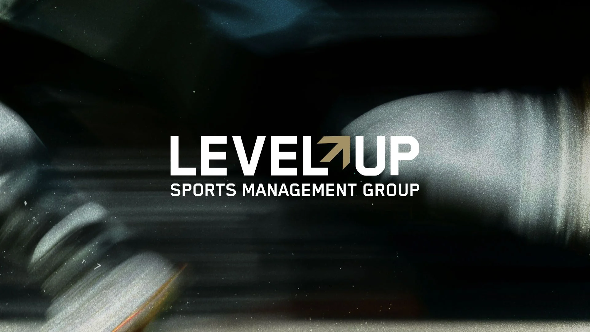
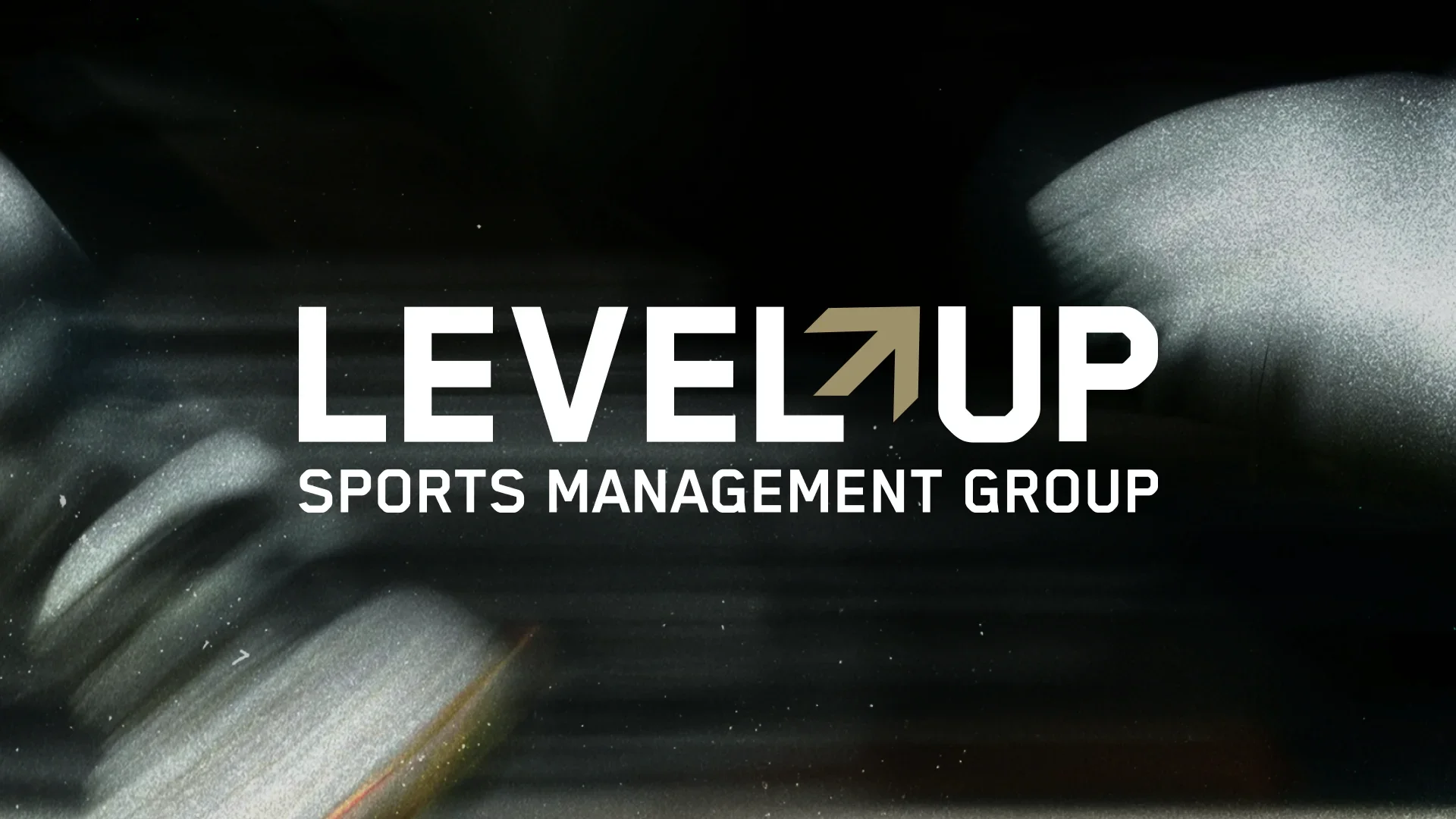
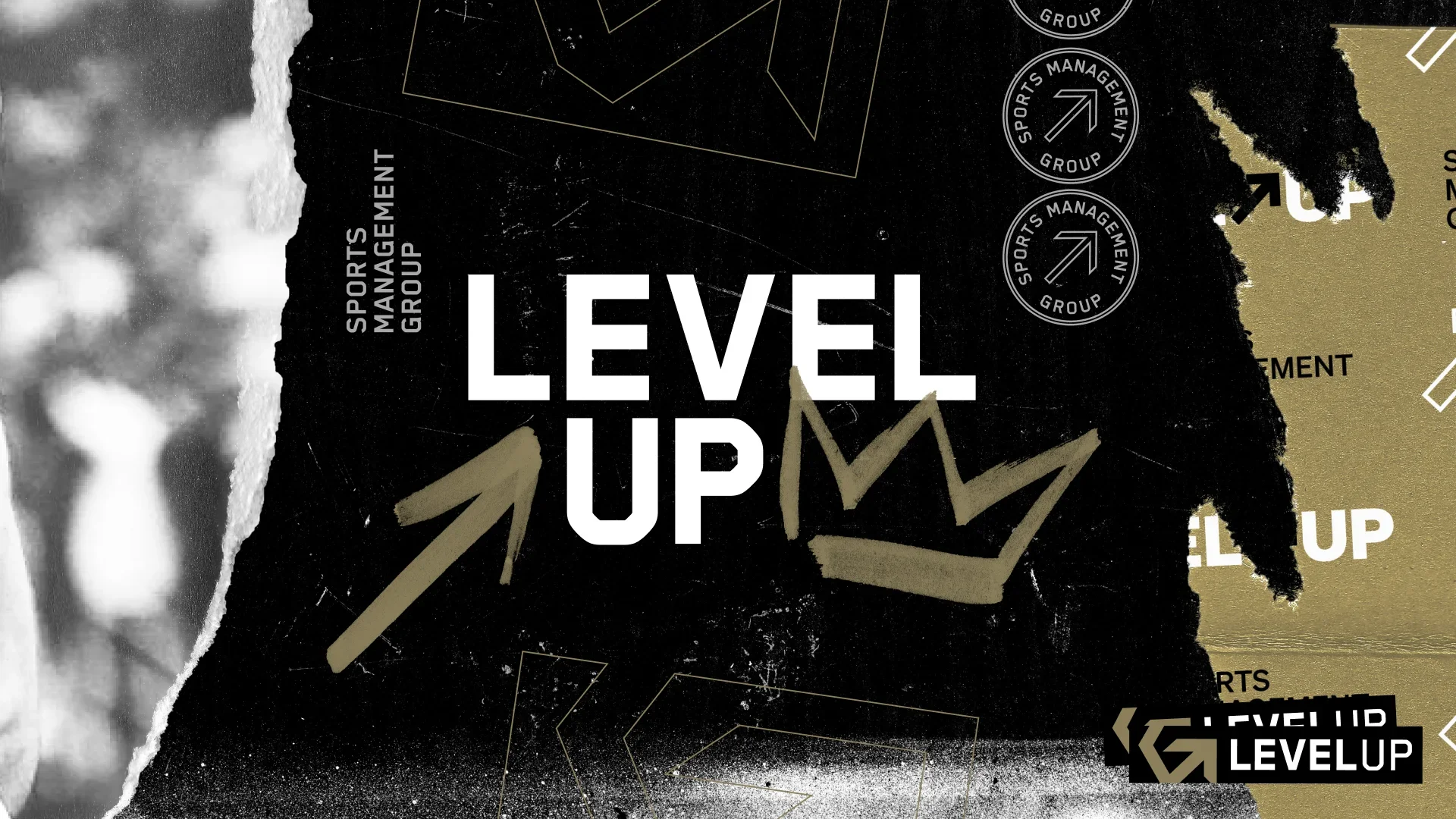
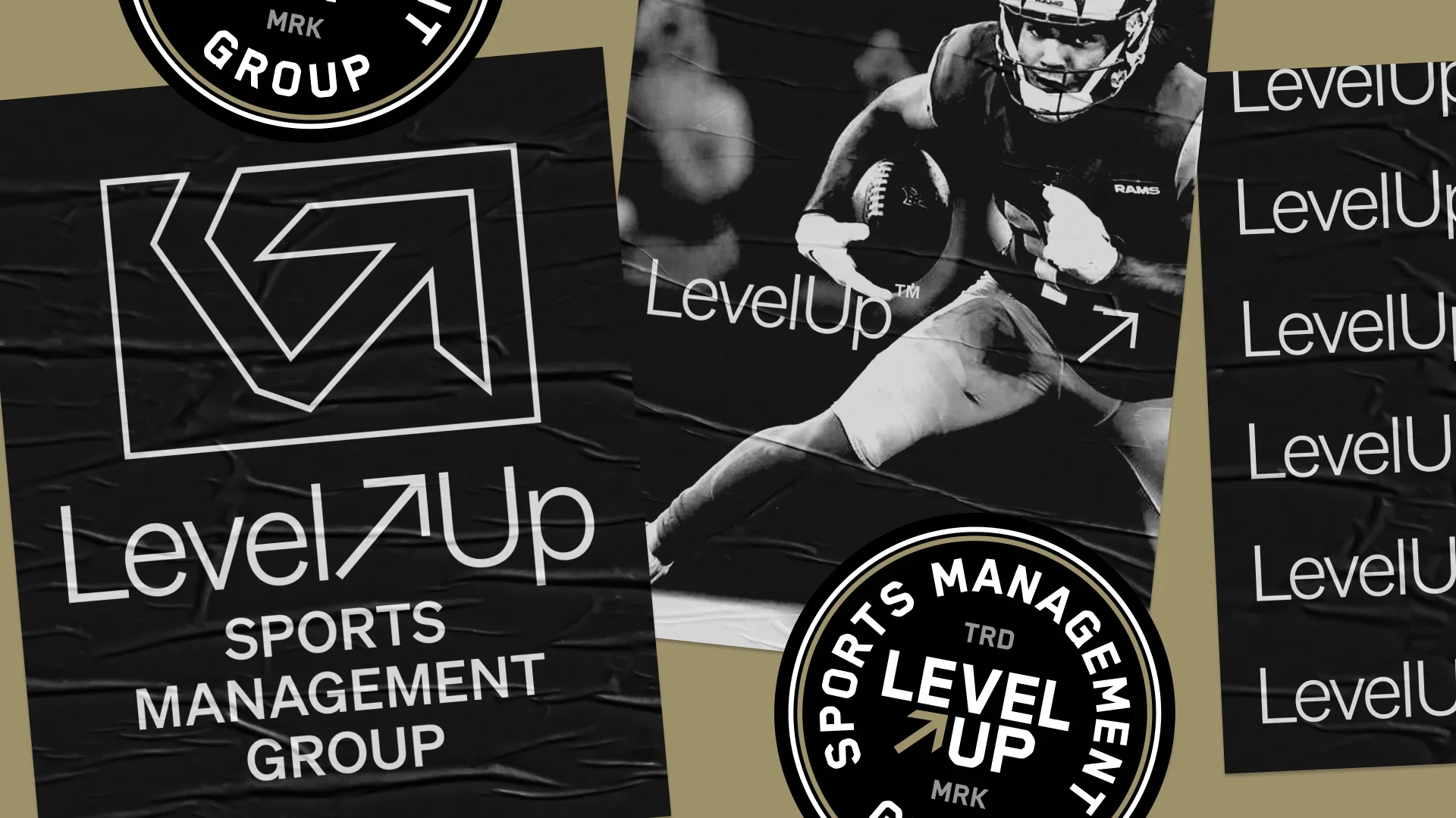
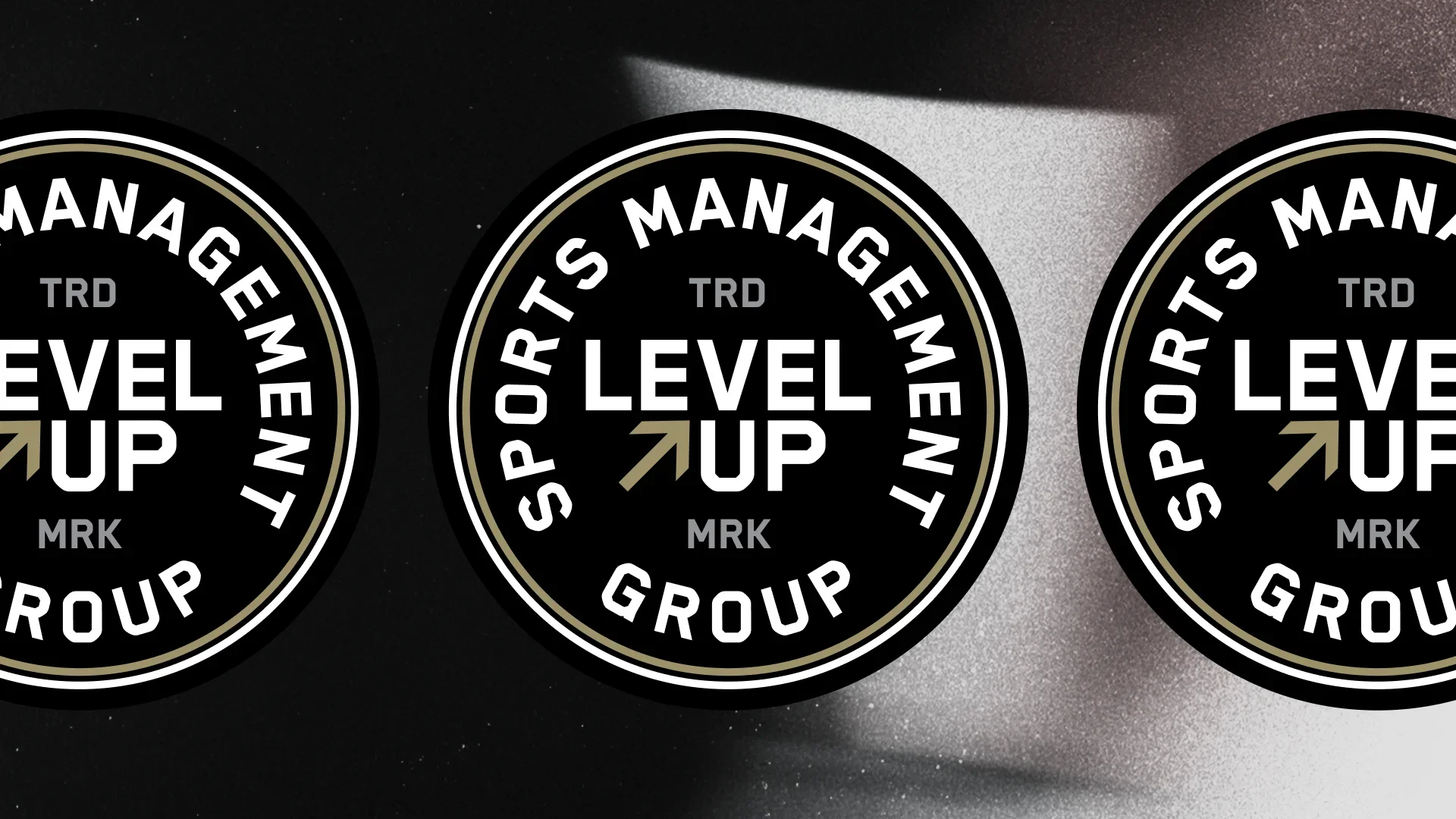
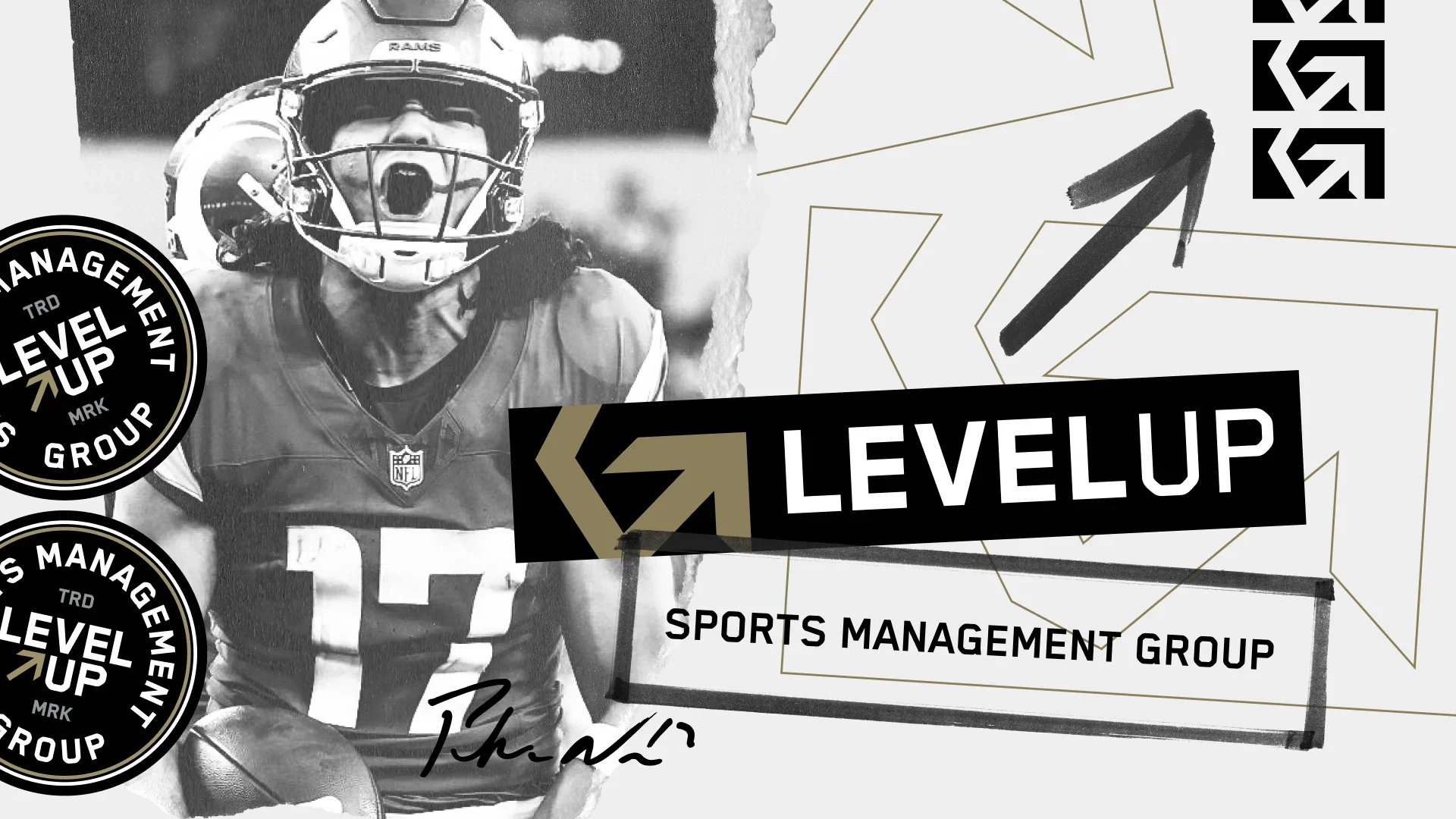
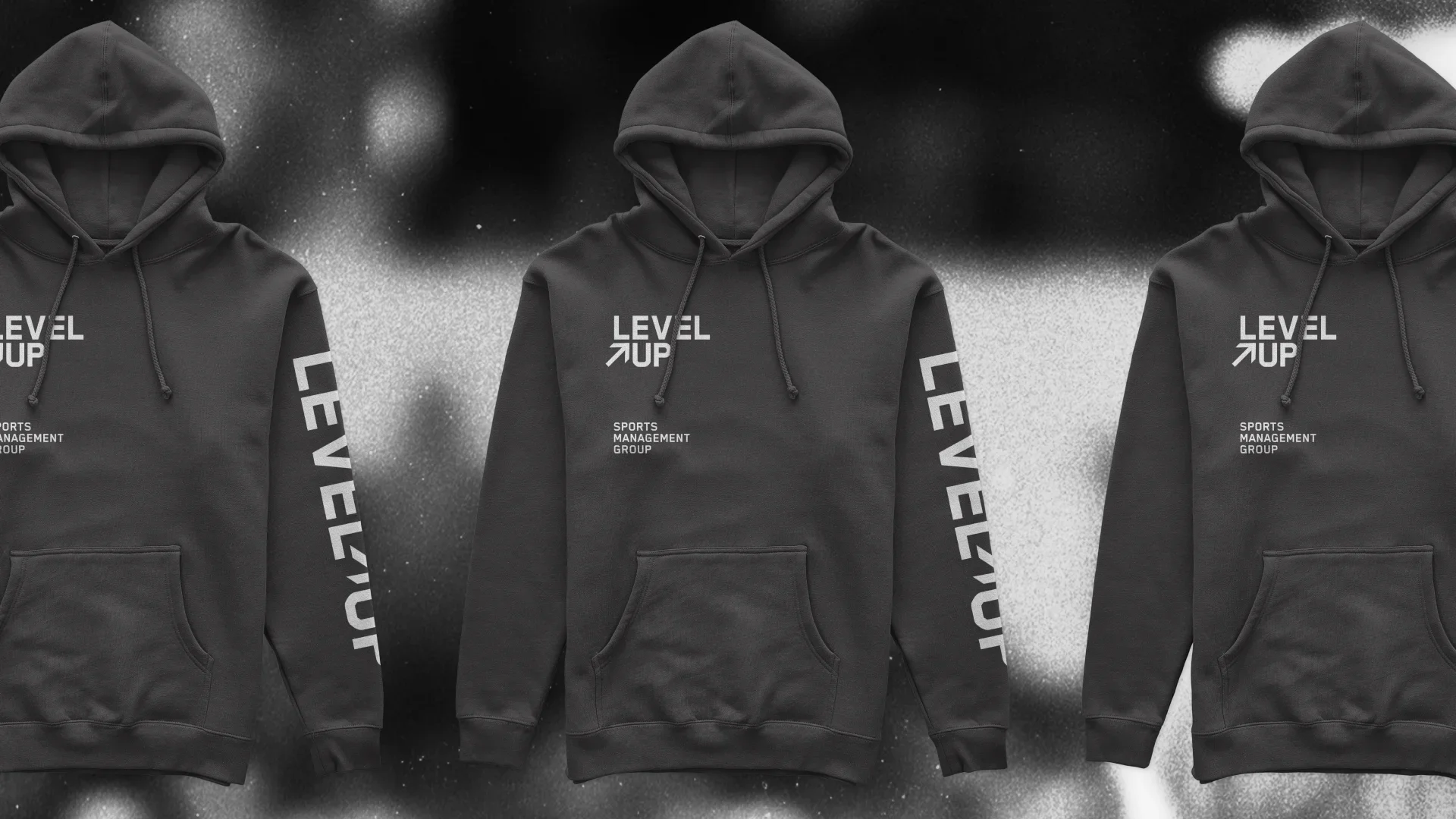
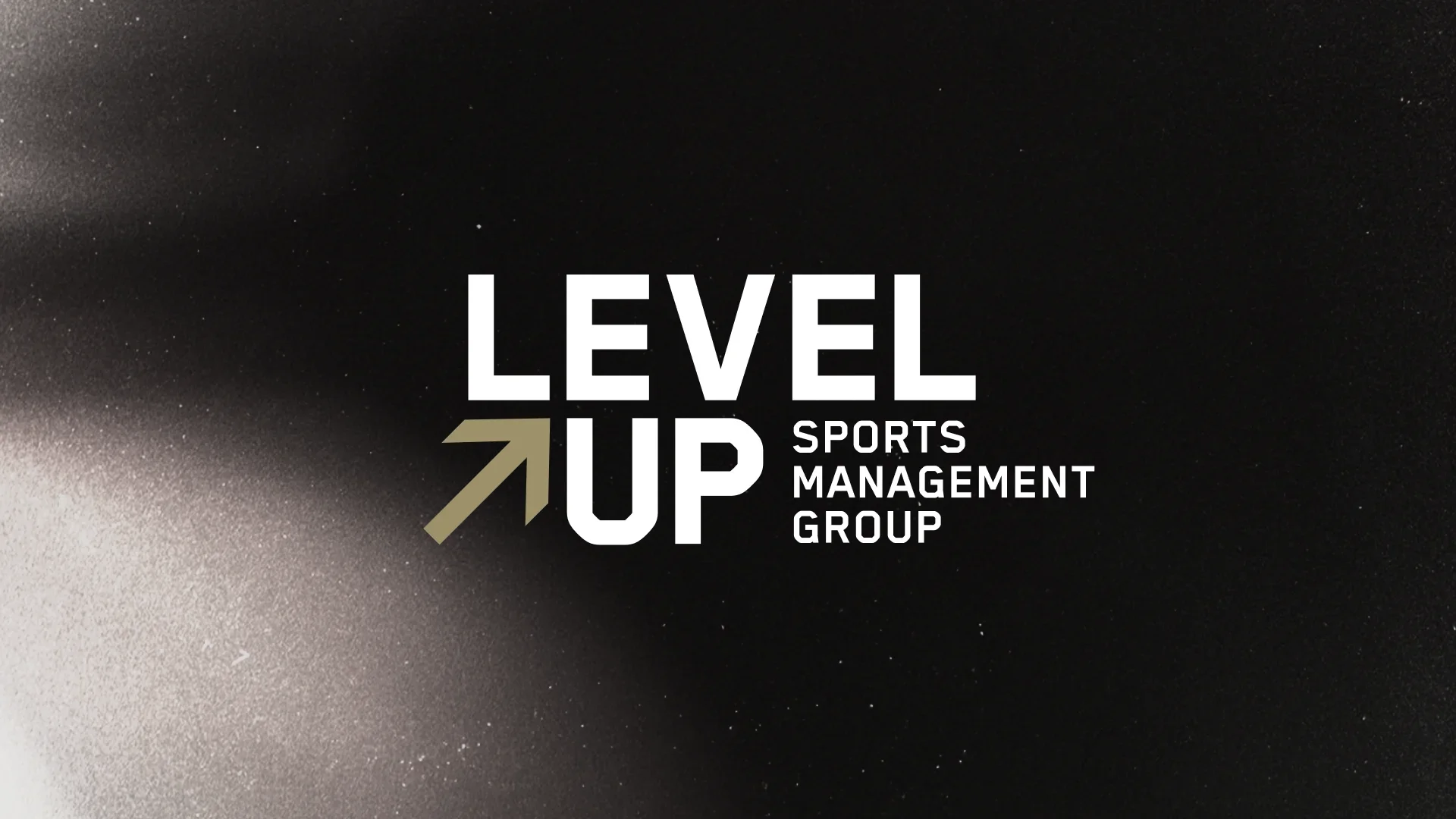
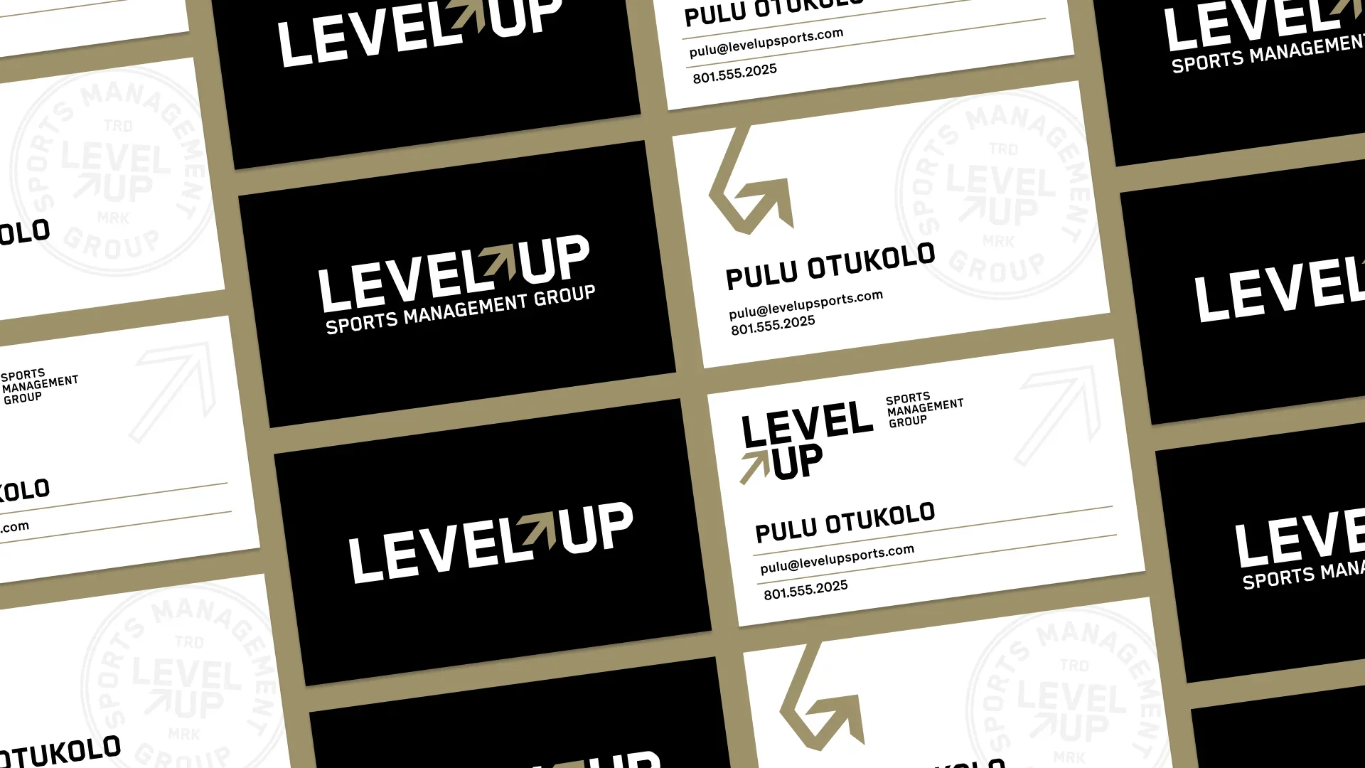
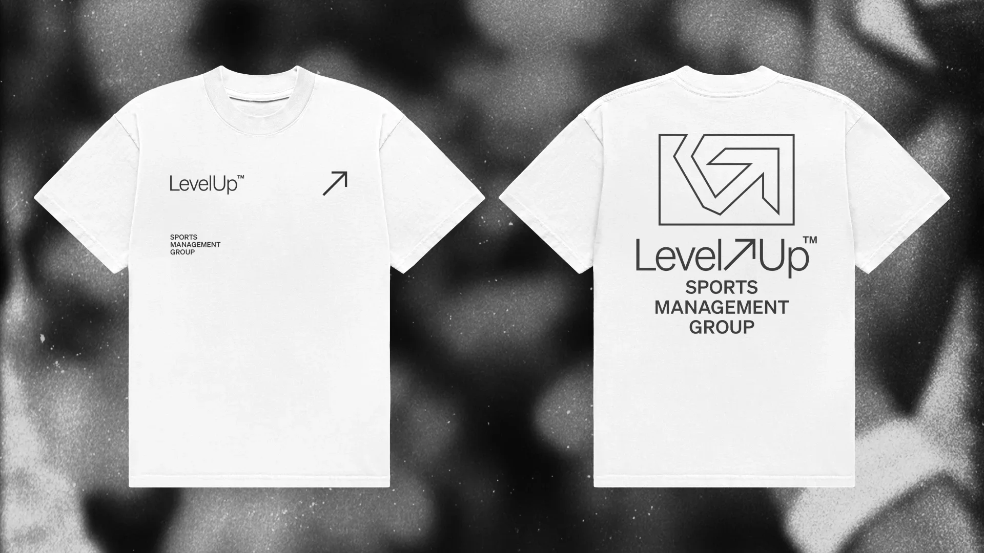
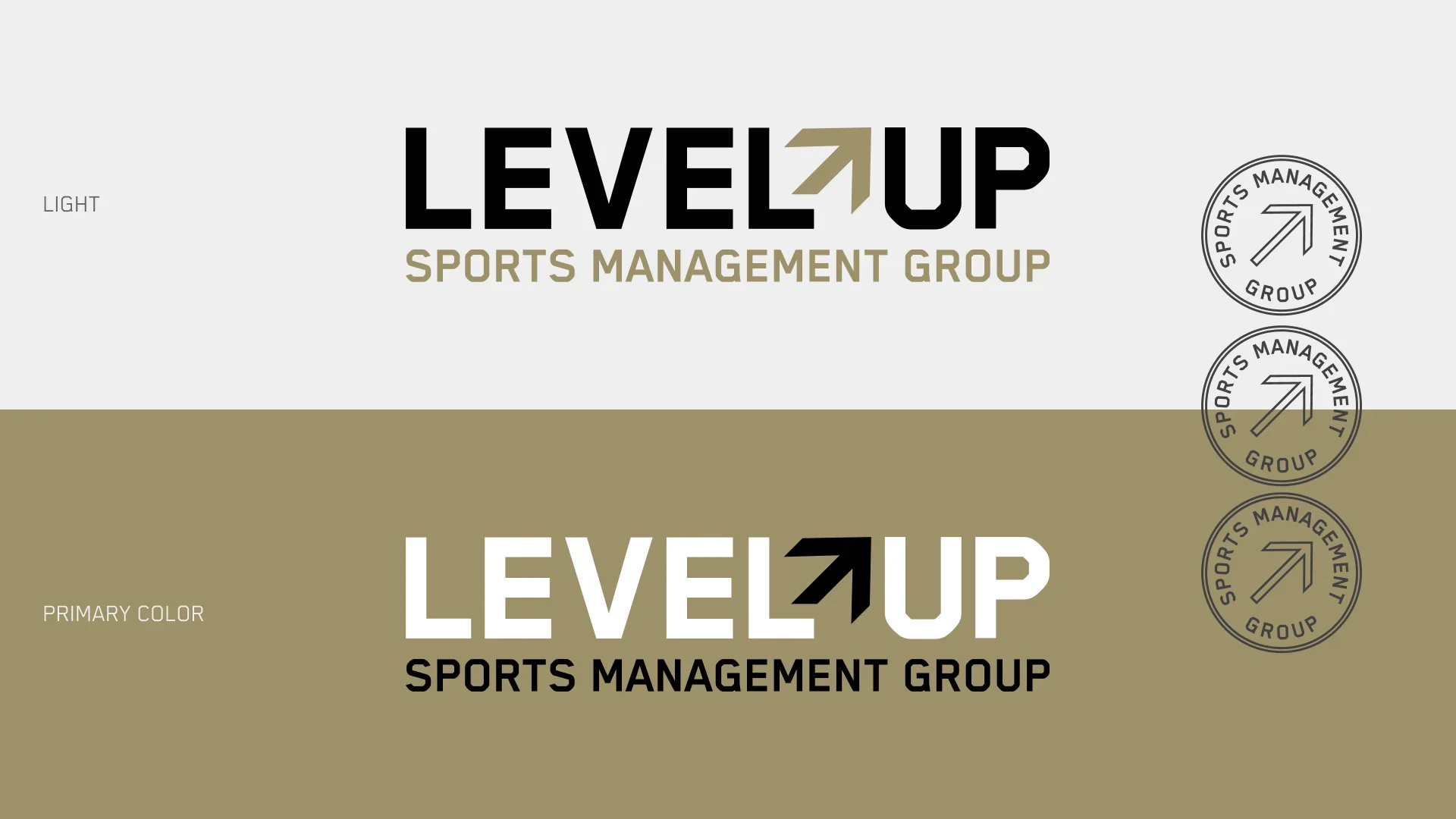
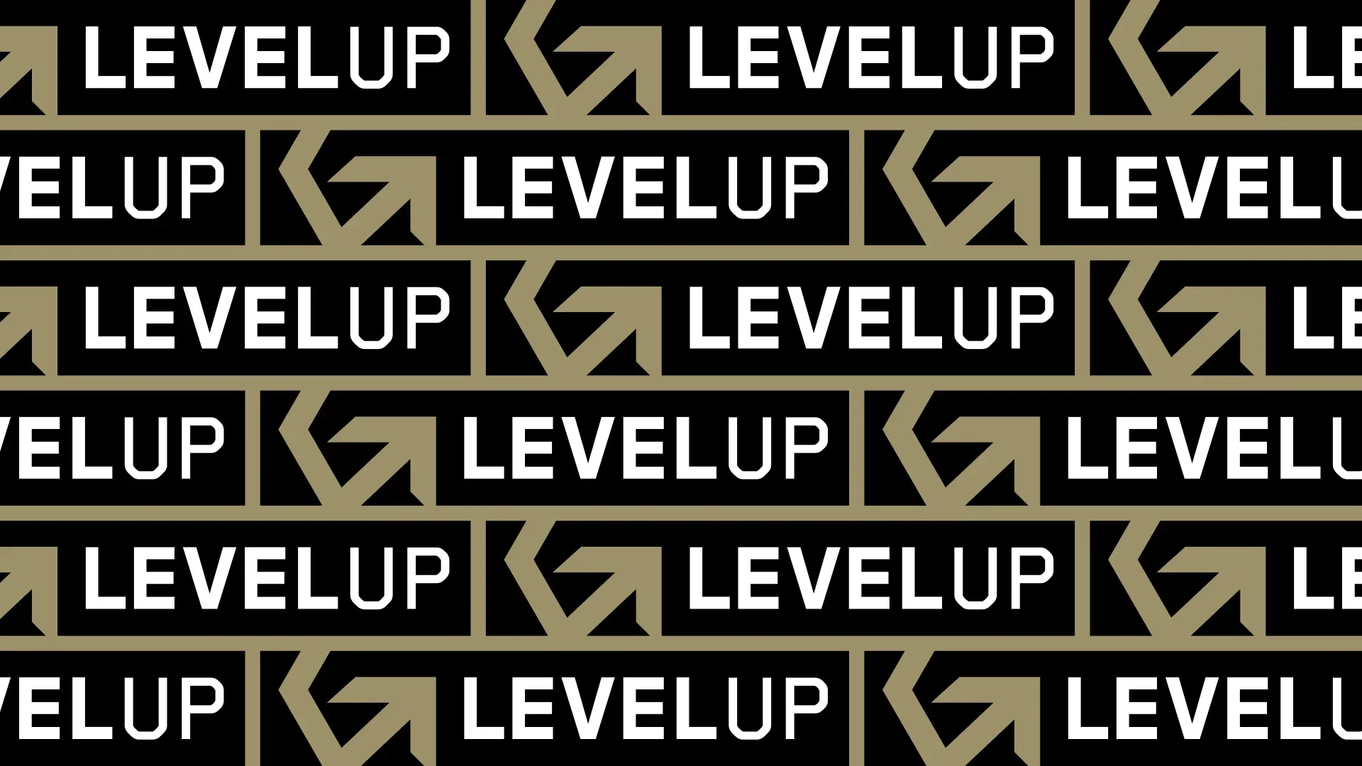

An identity system developed for a sports management agency, centered on forward momentum. A minimal arrow integrated into the logotype reinforces direction, focus, and intentional progress while maintaining a clean, professional presence. Inspired by on-field symbolism, the up-and-to-the-right arrow reflects success driven by smart decisions, timing, and execution. Athletic yet modern typography balances competitive energy with credibility, positioning the brand for elite athletes, agents, and partners.